
How Cozy Paint Colors Can Warm Your Home
November 10, 2026
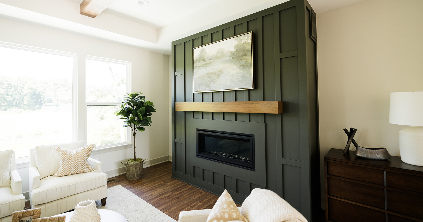
Architecture shapes a house, but a thoughtful color palette brings in the warmth that makes it welcoming.
When you walk into a thoughtfully designed space, you can sense the difference. The colors feel balanced, the atmosphere is inviting, and the room encourages you to settle in and stay awhile.
As professional painters, we often see clients try to capture this welcoming feeling solely through new furniture, plush rugs, or accent pieces. While those details help, the most effective way to infuse genuine warmth into a room starts on the walls.
Whether you are designing a cozy family living room or a welcoming lounge for your small business, color sets the foundation. If you want to create a space that feels immediately inviting, here is how a thoughtful paint palette can get you there.
Replace Cool Neutrals with Warmer Paint Colors
While crisp gallery whites and cool, blue-toned grays offer a beautiful, modern aesthetic, they often shine in spaces with abundant, bright natural light. In rooms with standard indoor lighting, cozy paint colors can boost perceptions of warmth.
If your goal is to create a warmer environment, neutrals with inviting undertones offer an appealing alternative:
- Creamy Whites: White bases with gentle yellow, blush, or beige undertones, like Sherwin-Williams Alabaster or Benjamin Moore Swiss Coffee can capture indoor light with a soft glow.
- Earthy Clay and Sand Tones: Muted terracotta, soft ochres, and warm sand shades provide an organic, grounded feel that connects the interior to the natural world.
- Dusty Pinks and Mauves: A muted, earthy pink with heavy brown or gray undertones acts as an unexpected neutral. It adds a sophisticated layer of color while casting a soft, universally flattering light across the room.
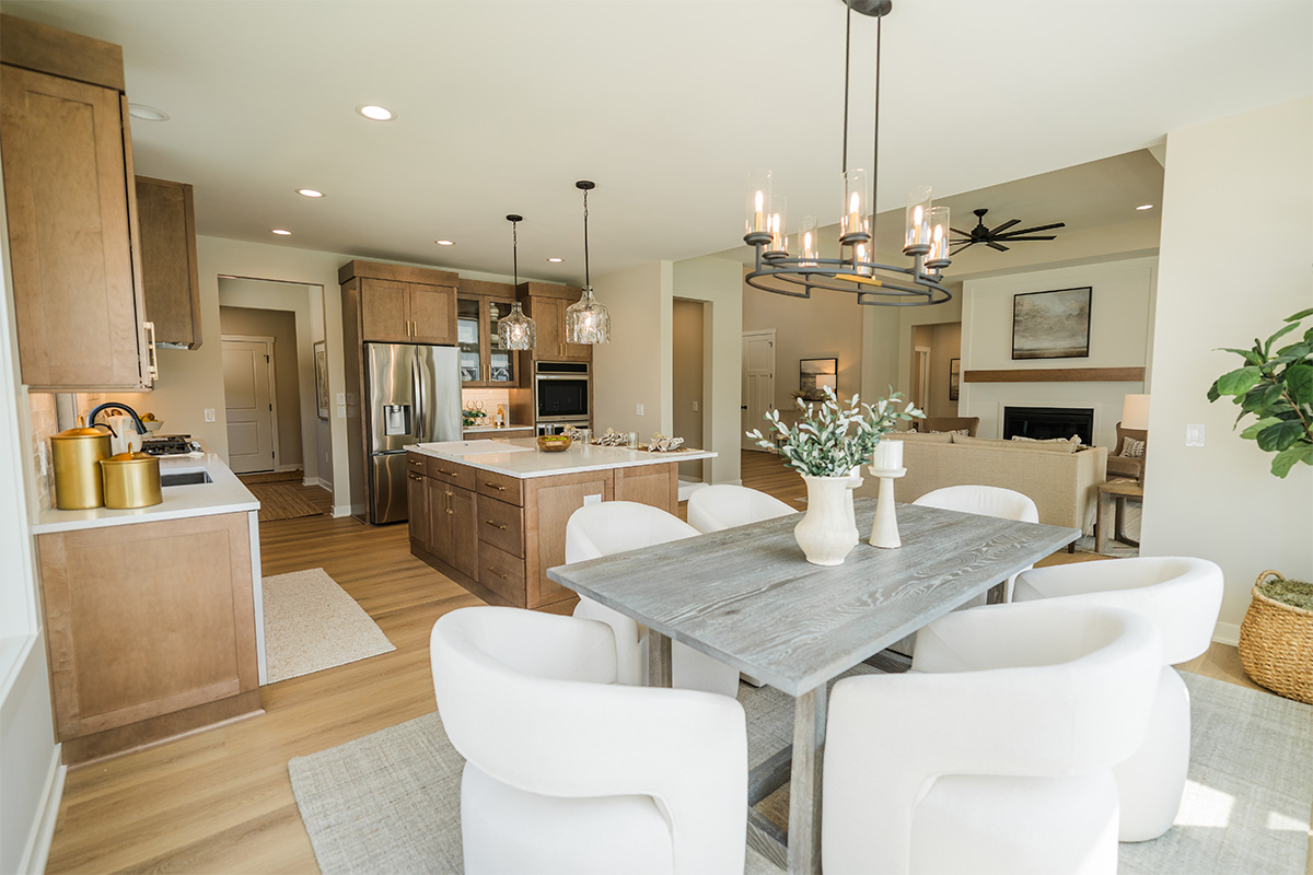
Embrace Color Drenching for a Cozy, Cocooning Effect
If you want a more immersive environment, color drenching is a highly effective design technique. This approach involves painting the walls, trim, baseboards, doors, and occasionally the ceiling in the same hue.
By eliminating the contrast of a different color on baseboards and trim, you extend the visual boundaries of the room. Corners start to soften and the ceiling feels integrated rather than separate, giving the entire space a more fluid, continuous flow.
The Professional Approach: To prevent a color-drenched room from looking flat, we recommend varying the paint sheens. A flat or eggshell finish on the walls absorbs light evenly, while applying a satin or semi-gloss finish to the trim and doors in the same color introduces a subtle, sophisticated dimension.
Use Rich, Saturated Paint Colors to Add Depth
We often paint interior spaces with light, reflective colors especially in rooms with abundant natural light that maximizes the perception of space. Choosing a richer, more saturated palette can complement a room’s natural proportions and create a more intimate environment.
Deep forest greens, rich espresso browns, and velvety charcoal blues absorb light rather than reflecting it. Because these tones do not reflect hard edges, they visually soften the room’s boundaries. Instead of feeling confined, the space feels grounded and intentionally proportioned.
The ABCs of Designing with Darker Tones
When working with deeper colors, a few professional adjustments help the space feel balanced and sophisticated:
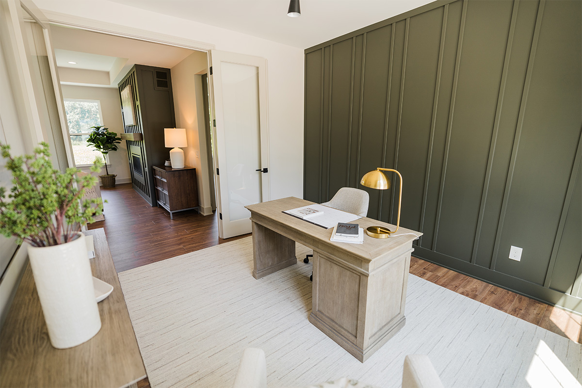
- Acknowledge Architectural Details: Saturated colors can effectively highlight features. A saturated hue accentuates the craftsmanship of elements like crown molding, built-in shelving, or board and batten, adding physical texture and shadows.
- Balance Cozy Paints with Furniture and Flooring: You do not need an entirely dark room to use deep paint colors. Incorporating mid-tone wood furniture, woven textiles, or lighter flooring can help create layers of visual interest.
- Consider Lighting and Reflection: Dark walls showcase well with low, localized lighting. Floor lamps, sconces, or warm task lighting allows rich paint colors to reveal undertones and soft gradients of shadow.
Darker colors often work well for rooms where you want to foster focus, privacy, or quiet relaxation. Home offices, bedrooms, or dining spaces can benefit from the grounding effect of a deeply saturated palette.
Create a Welcoming Space with Contrasting Trim
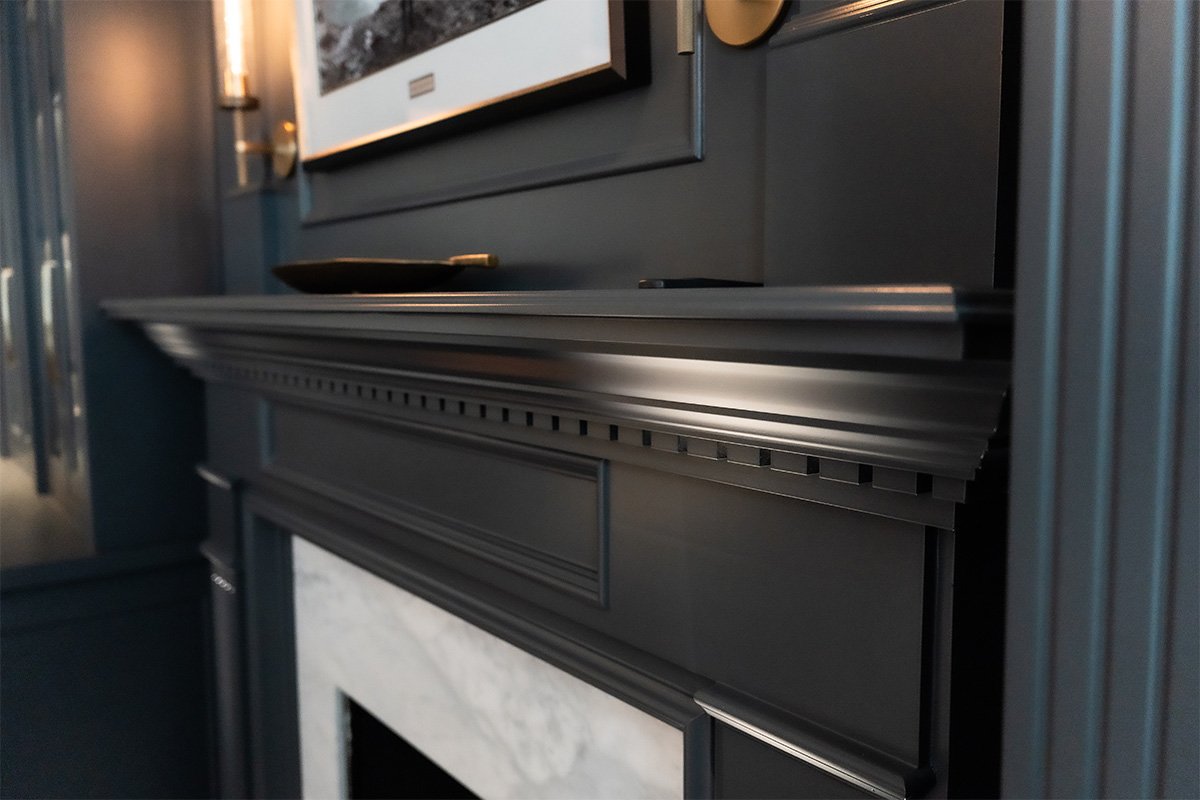
You can also achieve a cozy aesthetic by reversing the traditional palette. Keep the primary walls a warm, soft neutral, and apply a deeper, contrasting accent color to the trim, doors, and custom built-ins.
This approach draws inspiration from classic, historic interiors. Framing a warm ivory wall with a deep burgundy bookcase or soft taupe walls with deep moss-green window casings help anchor the room. The contrasting lines highlight the craftsmanship of the molding, adding architectural weight and making the space feel thoughtful and peaceful.
Best Practices for Implementing Contrasting Trim
We consider the following design principles to help cozy paint colors balance the look:
- Establish a Consistent Undertone: The secret to a cohesive look is ensuring the wall color and the trim color share a similar temperature. If you choose a trim color with warm undertones (like an earthy olive green or warm charcoal), pair it with a wall color that also leans warm (like a creamy white or soft beige). This prevents the contrast from feeling harsh or disconnected.
- Determine the Right Scope: You don’t have to paint every piece of wood trim with this technique. If your room has minimal architectural molding, you can focus the contrast entirely on a single feature, such as a set of French doors, the fireplace mantel, or a wall of custom cabinetry. This creates a clear focal point without overwhelming the rest of the space.
- Coordinate the Sheen Levels: When using contrasting colors, the sheen of the paint plays a large role in how the contrast is perceived. Applying a flat or eggshell finish to the walls keeps them soft and receding, while a satin or semi-gloss finish on the darker trim catches the light, drawing subtle attention to the architectural lines of the room.
Flipping the contrast is effective in areas where you want to add distinctiveness without sacrificing brightness. Entryways, hallways, and living rooms with molding can benefit from the structural definition and understated elegance of contrasting trim.
Putting Cozy Paint Colors to Work in Your Home
Creating a cozy home isn’t about choosing the darkest or warmest paint color. It’s about finding the right combination of color, contrast, and finish to make your space feel welcoming. Whether you’re refreshing a single room or rethinking your home’s interior palette, thoughtful paint choices can make a meaningful difference.
At PMV Painting, we help homeowners realize their vision. From selecting complementary colors and finishes to achieving clean, consistent results, our team can help create a space that feels just right for you. Contact us to discuss your next interior painting project.